How to Narrow Down Tattoo Ideas Without Copying a Design
Narrow scattered tattoo inspiration into one clear brief with a must-keep, flexible, and avoid card, illustrated by a documented two-concept test.

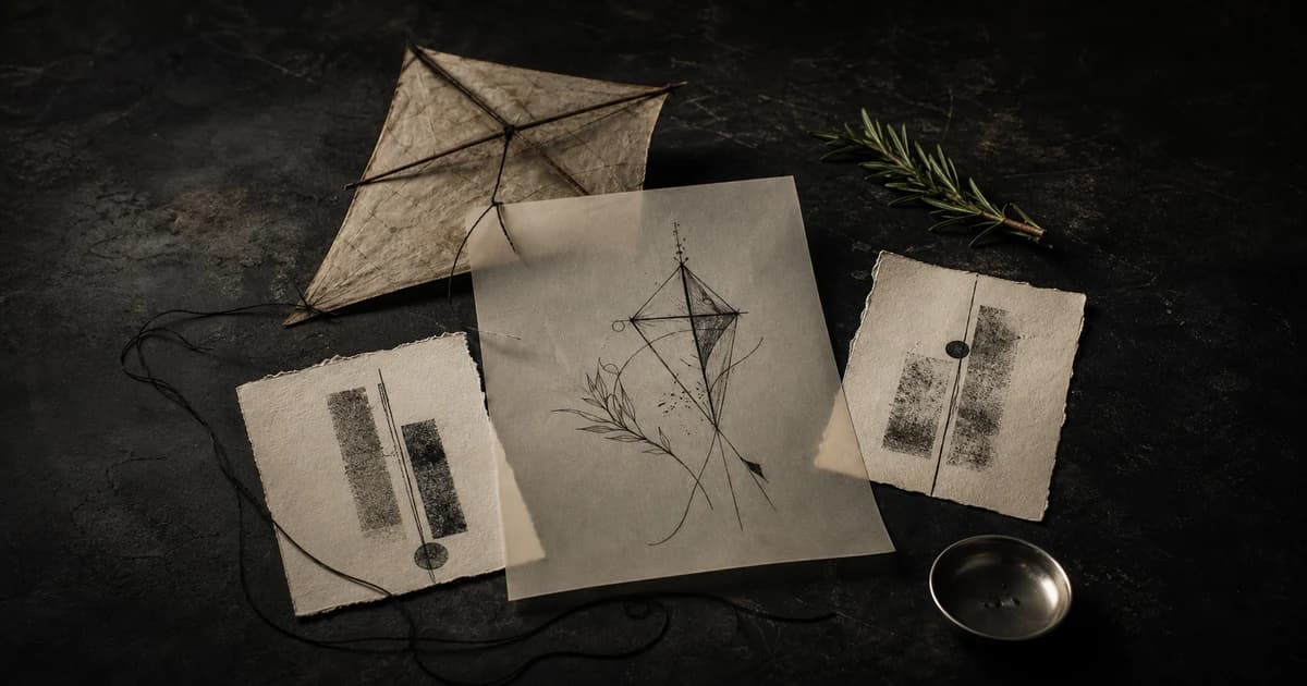
You do not need a finished drawing to have a usable tattoo idea. You need to know what must stay, what can change, and what you do not want. That is enough to explore original directions without asking an artist to copy someone else’s tattoo.
Start with a short decision card, compare two directions against it, and keep the one whose subjects and composition fit your intent. You can use sketches, annotated references, or generated concepts. Below, one documented BeforeOuch AI Tattoo Generator request shows how the comparison works.
Start with source material, not a finished tattoo
A starting point can be a person, object, place, memory, phrase, shape, body area, or visual quality you repeatedly notice. It does not need an elaborate symbolic explanation. It only needs to give you something specific enough to react to.
Try collecting two or three kinds of source material:
- a photo of the actual subject, such as a plant, animal, keepsake, or building
- a non-tattoo artwork or material reference that shows the line, texture, contrast, or mood you like
- a few examples from an artist’s own portfolio that show the kind of work you would trust them to make
If you save another person’s tattoo, treat it as evidence of a preference, not a design to reproduce. Identify the part you like, such as the open composition, heavy black shape, or fine botanical detail. Custom tattoo artist Ryan Jenkins similarly recommends using references to communicate mood, style, detail, and composition while leaving room to adapt the work to the individual body (Ryan Jenkins Tattoos).
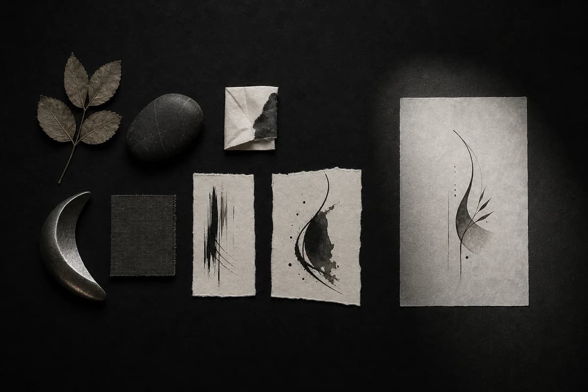
Conceptual editorial image: useful source material can converge on shared curves, rhythm, and contrast without supplying a tattoo to copy.
Separate what matters from what is still open
Before collecting more images, make a three-column decision card.
| Must keep | Flexible | Avoid |
|---|---|---|
| Subjects that define the idea | Exact angle and orientation | Symbols you do not want |
| A relationship with personal importance | Spacing and overlap | Lettering or color, when unwanted |
| Literal wording, if text is essential | Overall silhouette and canvas shape | A copied composition |
| A body-area constraint that changes the shape | Supporting details and drawing decisions | Anything that changes the meaning |
Must keep should be short. If every detail is fixed, there is little room to discover a stronger direction or benefit from an artist’s judgment.
Flexible is not unimportant. It names the decisions you are ready to compare rather than guess in advance.
Avoid should protect the idea from specific unwanted changes. Name the few things you would reject, such as lettering, added symbols, or a copied composition.
A worked example: kite, rosemary, and thread
For our test, the source material was deliberately neutral: a paper kite, one rosemary sprig, and a loose thread. The decision card was:
| Must keep | Flexible | Avoid |
|---|---|---|
| One paper kite | Vertical, diagonal, or compact composition | Lettering |
| One rosemary sprig | Distance and overlap between the subjects | Extra symbolic objects |
| One loose thread visibly connecting them | Black distribution and amount of open space | A finished-stencil claim |
| A quiet, slightly asymmetrical feeling | Canvas ratio and exact line treatment |
That became one plain-language request:
A paper kite and one rosemary sprig connected by a loose thread, quiet and slightly asymmetrical, no lettering.
The request names the subjects and their relationship while leaving composition open. BeforeOuch develops visual directions from that text and the selected style and color. If a particular angle or layout matters to you, include it in the request.
Use controls for style and color
We selected Illustrative and Black & Grey in the interface instead of repeating them inside the text. This keeps two different kinds of decisions separate:
- the text protects the subject, relationship, mood, and exclusion
- the controls set the style and color treatment
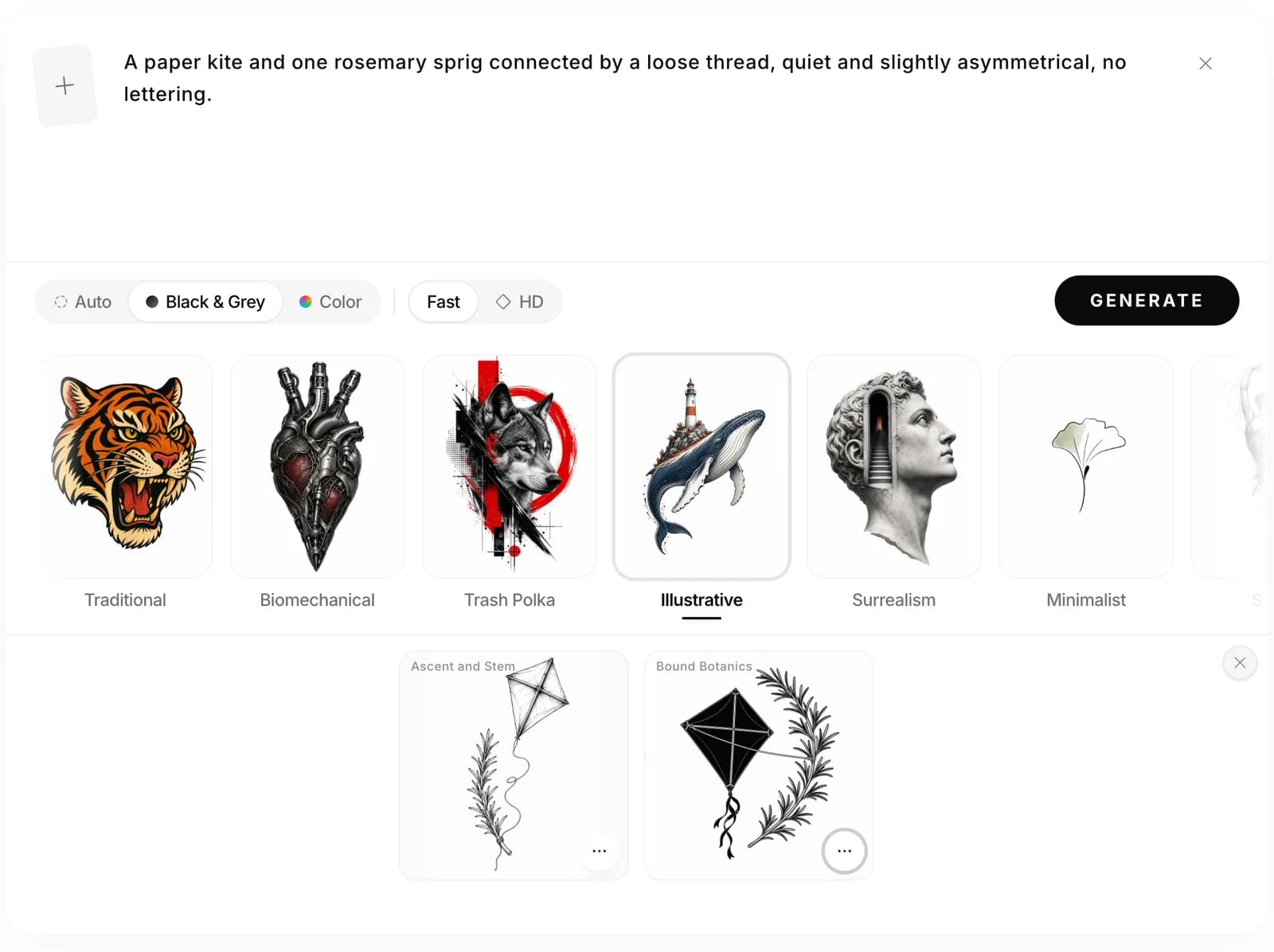
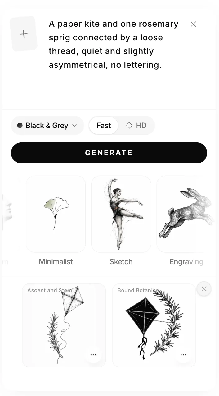
Archived test, July 28, 2026: one request using Illustrative, Black & Grey, and the then-available Fast setting. Both returned outputs are shown without design edits; article copies were resized and compressed. The current interface has style and color controls, with no Fast/HD selector.
The prompt fixed the ingredients but left the overall shape open. The Generator returned a tall, airy direction and a compact, high-contrast direction. That difference gives us a useful decision to make.
Compare requirements before visual polish
The first direction, Ascent and Stem, gives the kite room to rise above the rosemary. Its long silhouette, thin linework, and open background support the requested quiet feeling.
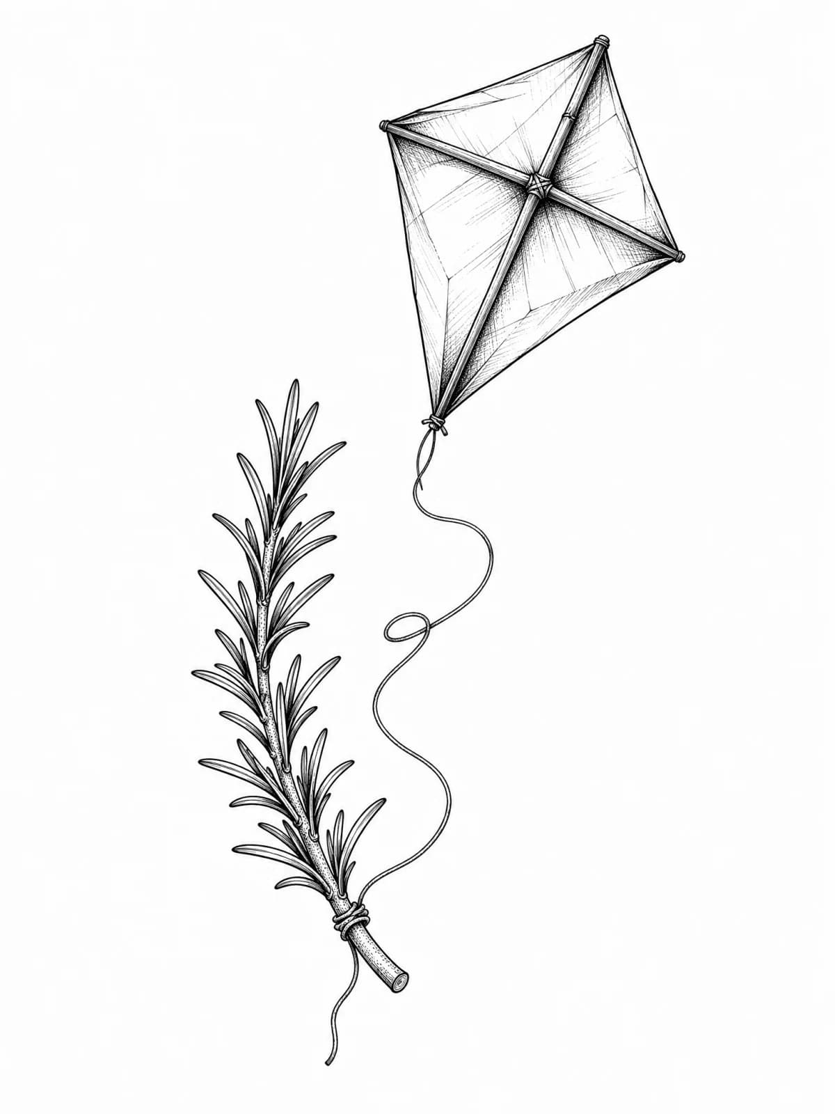
Direction 1: Ascent and Stem, returned without editing.
The line is continuous. It drops from the kite, travels through a loose double curve, and finishes at the wrapped base of the rosemary like a kite being flown from the sprig. The open distance between the subjects makes the connection feel light rather than bound.
The second direction, Bound Botanics, uses a compact diagonal relationship. A thicker, nearly taut cord runs from the side of the kite to the middle of the rosemary, making the two forms feel tied together rather than one flying from the other.
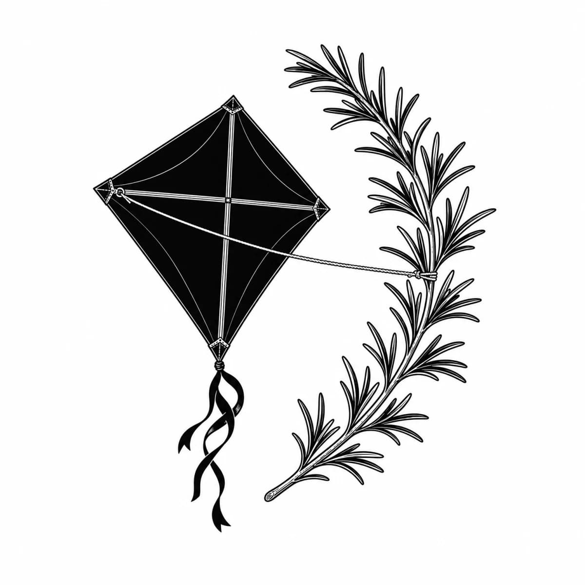
Direction 2: Bound Botanics, returned in the same generation without editing.
The solid black kite, tighter spacing, and straighter cord make this direction heavier and less quiet. It keeps the subjects and connection, but the taut cord misses the requested loose relationship. That is a concrete reason to reject it for this brief, even if you like the drawing.
For this decision card, the first direction is the closer match. It preserves the kite, rosemary, continuous loose line, quiet mood, and asymmetry. The second direction remains useful because it reveals an interpretation we can reject: compact, dark, and tightly bound.
Use the same comparison questions for your own results:
- Are all must-keep subjects present?
- Is the important relationship visible without an explanation?
- Did anything from the avoid column appear?
- Which flexible decision did this direction resolve well?
- What should change before you show it to an artist?
Change one decision in the next request
If neither direction works, keep the accepted parts and clarify one failed decision. You can use the revised brief for another generation or discuss it with an artist. A new generation can change other details too, so check the whole decision card again.
If the first direction feels right but you want the attachment to read faster at thumbnail size, a useful second request would be:
A paper kite flying above one rosemary sprig, with one continuous loose thread clearly attached to the wrapped base of the stem, airy vertical composition, no lettering.
This proposed revision makes the attachment point more explicit while retaining the flying-kite relationship. We did not run this second request; it illustrates how to revise the brief.
Changing one decision at a time also tells you something about your own preference. If you keep rejecting compact compositions, open vertical flow belongs in the decision card rather than in a folder of unexplained screenshots.
Bring a direction to the artist, not a copy request
Once one direction is useful, stop treating the generated image as a finished tattoo. Turn it into a consultation brief:
- Core idea: the subjects and relationship that must remain
- Chosen direction: what the selected concept clarified about flow, contrast, or composition
- Requested changes: the specific problems still visible
- Placement estimate: the body area and approximate size you are considering
- Creative room: the parts you want the artist to reinterpret
Reference images are useful, but the artist still needs room to adapt composition and scale. In an artist-informed first-tattoo guide, Allure recommends attaching references while not expecting the final design to duplicate another artist’s work; it also notes that size and placement estimates can change during the process (Allure).
Choose an artist whose portfolio already fits the direction. Look beyond fresh social posts when possible. New York tattoo artist Ariel Wei specifically recommends reviewing healed work so you can understand how an artist’s results change over time, according to the same Allure guide.
For the kite example, the handoff could read:
I want one paper kite flying above one rosemary sprig, connected by a loose thread at the wrapped base of the stem. I prefer the tall reference’s open feeling and do not want the solid black fill or taut cord from the compact reference. No lettering. I am considering a vertical placement, and I want you to redraw the concept for the body area and long-term readability.
Keep the artifact that helps you decide
Save the decision card, the one or two references that reveal your taste, the selected concept direction, and a short list of requested changes. Remove images that no longer affect the decision.
Copy this blank card if you want to start one now:
TATTOO DECISION CARD
Must keep:
Flexible:
Avoid:
One-line request:
Style / color:

COMPARE
[ ] Must-keep subjects present
[ ] Relationship reads clearly
[ ] Nothing from Avoid appeared
Chosen direction and why:
Rejected direction and why:

BRIEF FOR THE ARTIST
Requested changes:
Placement / approximate size:
What the artist can reinterpret:Once the concept is clear, use our guide to choosing tattoo placement to compare two body areas with a measured paper template and the clothes you actually wear.